
Busy Folks Wanted Healthy Food Fast from ThymeRoot
Here How We Made Ordering fast and Easier.
ThymeRoot was known for its delicious, healthy meals, but their online ordering experience was failing to meet the needs of their busiest customers seeking convenience. Their existing system was difficult to navigate, leading to frustration and lost orders. I led a comprehensive redesign to better serve their time-pressed customers and improve the digital experience.
Tools
Figma
Adobe XD
Jamboard
Google Sheets
Responsibility


The Challenge
ThymeRoot target audience—busy professionals—value healthy eating and convenience. However, their existing online ordering system presented significant challenges. Imagine trying to order a healthy lunch while battling a clunky checkout, a confusing menu, and a mountain of choices.
The time crunch is real: Balancing work, family, and healthy eating.
Understanding The User
User Research
I conducted interviews with ThymeRoot customers and analyzed website analytics to uncover pain points. Key findings:
Primary Audience: Professionals aged 30–45, often parents, with limited time for meal prep.
Additional Barriers: Beyond time constraints, users cited family obligations, personal interests, and challenges with grocery shopping as hurdles to accessing fresh, quality meals.
Quote: “I need healthy meals fast, but the website feels like a maze.” — ThymeRoot Customer
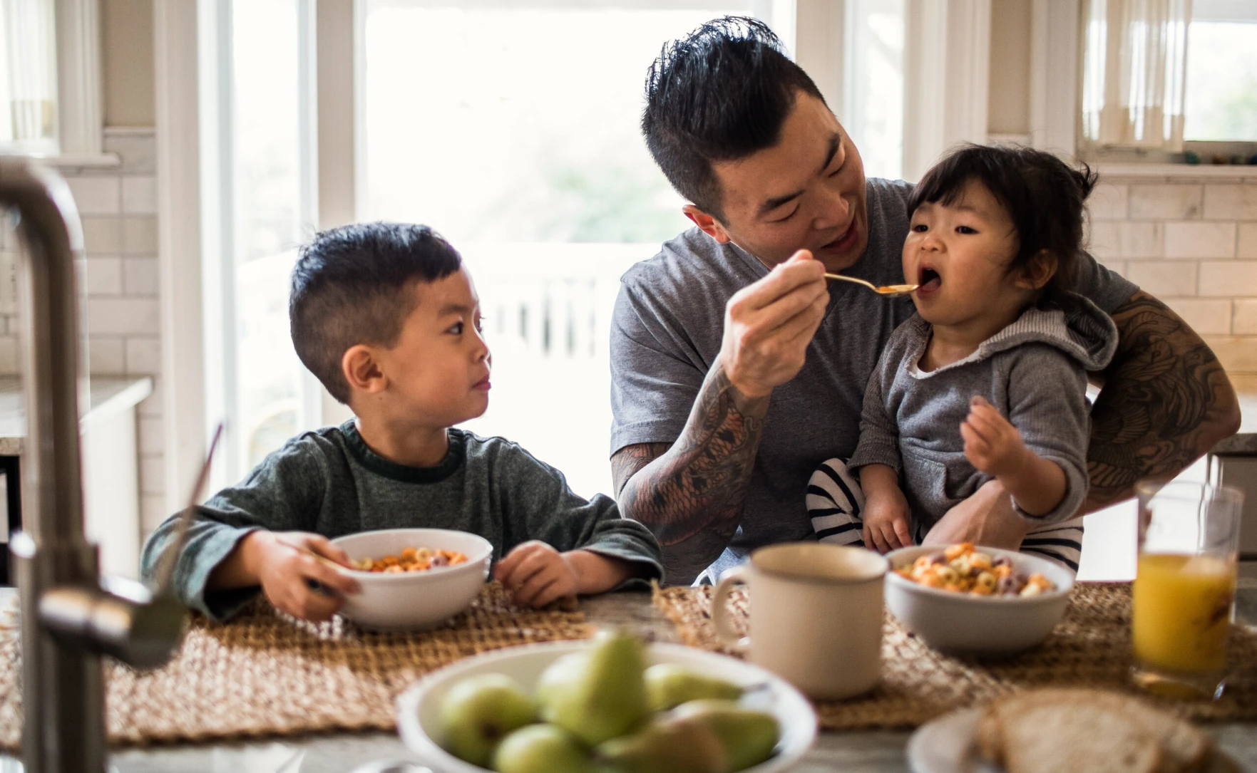
Meet Tara: Our Primary Persona
Based on research, I created a primary persona:

Name: Tara
Age : 39
Physician Assistant, mother of two
Tara works full-time and struggles to cook nutritious meals. Her dyslexia makes text-heavy interfaces challenging.
Pain Points
- Limited time
- Finds text-heavy menus frustrating (dyslexia)
- long checkout, unpredictable pickup times.
Goals
- Quick, healthy meals
- Simple ordering
- Reclaim some personal time.
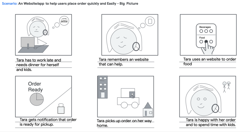
User Journey Map
I mapped Tara’s current experience to identify friction:
| Action | Task | User Feelings | Improvement Opportunities |
| Visit website | Enter website address | Excited to find meals | Reduce image sizes, Optimize load time (<2s) |
| Browse menu | Filter options | Frustrated (text-heavy) | Improve information architecture, add visual filters |
| Add to cart | Select item | Frustrated with small button size | Use larger, accessible buttons |
| Checkout | Complete Order | Annoyed (5 steps) | Simplify to 3 steps, add guest checkout |
Key Insights
- Navigation Issues: 85% of users struggled with menu navigation (interview data).
- Accessibility: Small buttons and dense text hindered users with disabilities.
- Checkout: Account creation caused 60% of cart abandonments (analytics)
Ideation & Design
Information Architecture
To address navigation issues, I:
- Conducted open card sorting with 12 users to organize content, resulting in a simplified sitemap with six tabs: Home, Menu, Order, Catering, Account, Contact.
- Prioritized “Order Now” placement above the fold for quick access.
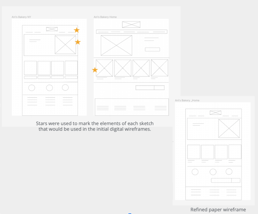
Low-Fidelity Wireframes
After finalizing the sitemap, I focused on organizing content on each page:
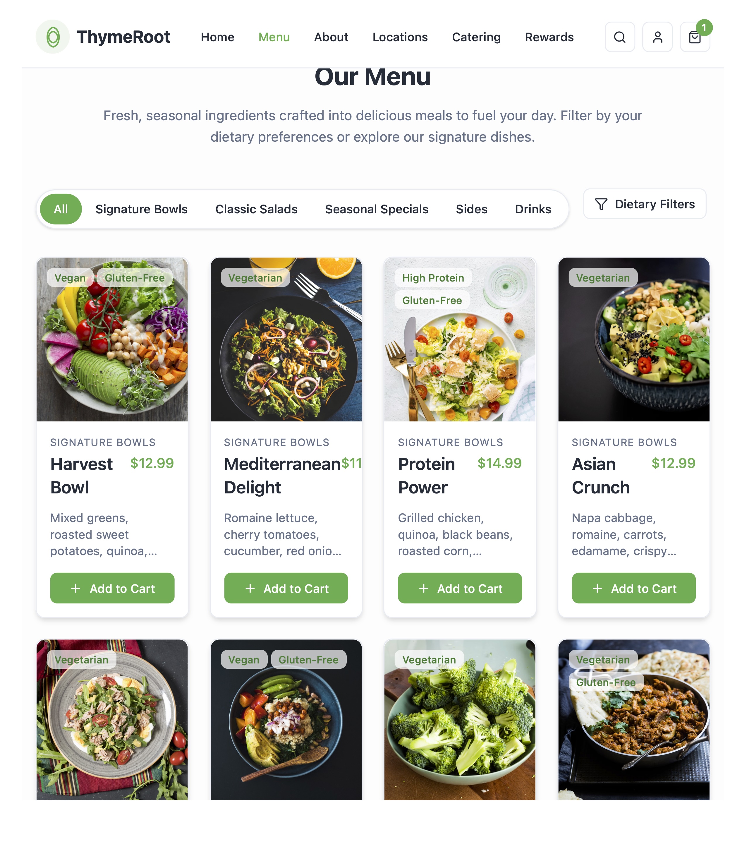
- Menu Page: Visual filters (e.g., gluten-free, vegan) and larger buttons.
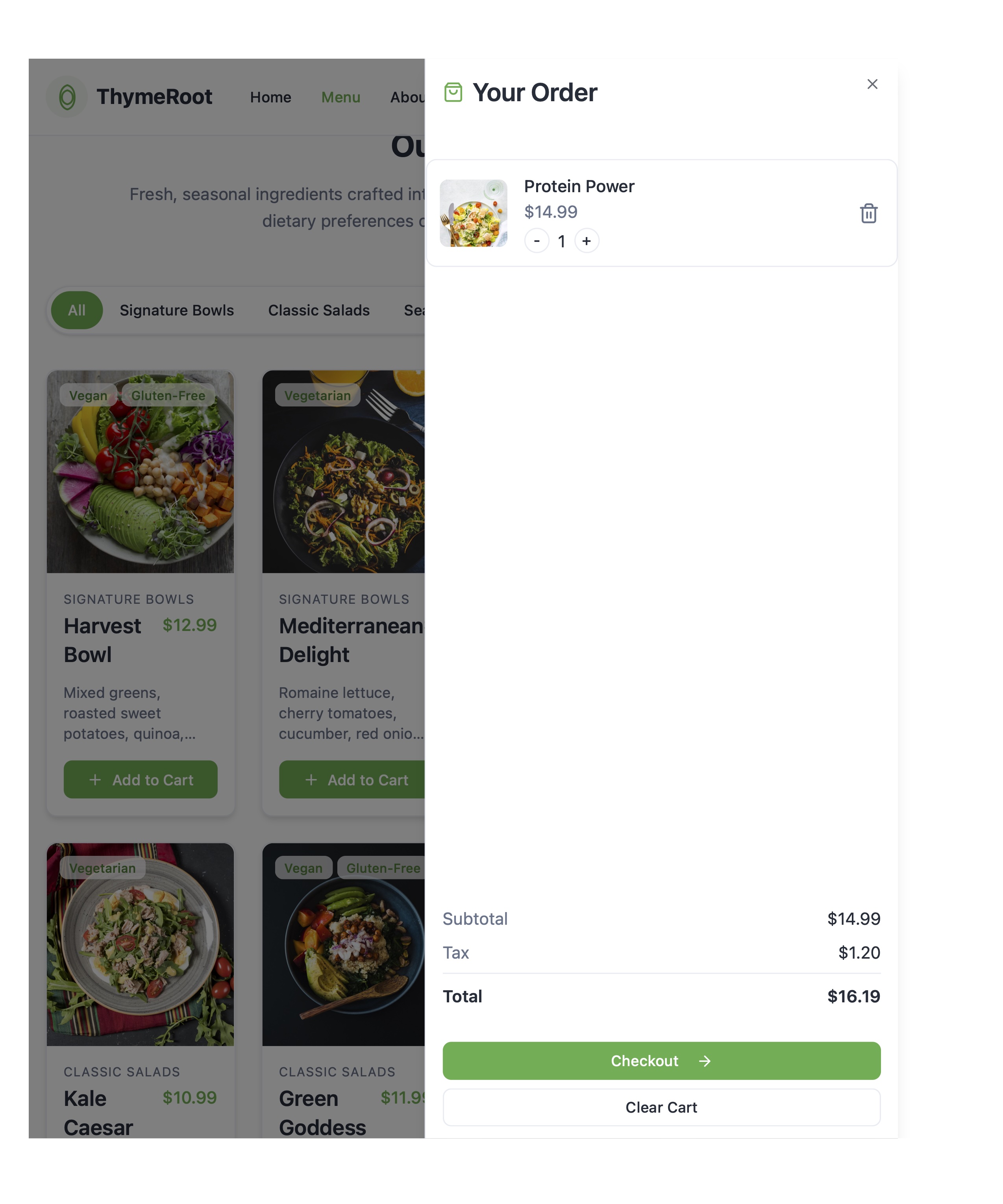
- Checkout: Three-step flow (cart, payment, confirmation)
- Responsive design: Simultaneously developed wireframes for both desktop and mobile
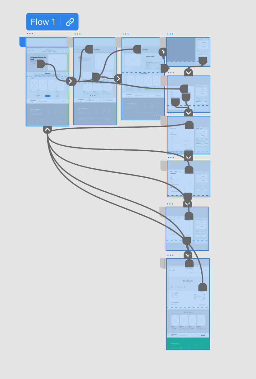
Low-Fidelity Prototype
I built an interactive prototype linking menu browsing, item selection, and checkout. Feedback from a five-persons led to:
Valuable input led to repositioning elements like the “Dietary Filters” on the menu page for better visibility and usability.
Usability Testing
I tested the prototype with users, simulating Tara’s tasks (e.g., “Order a vegan salad in under 3 minutes”). Findings:
- Search: 70% struggled to find specific items due to weak search functionality.
- Checkout: Guest checkout reduced friction, but users wanted an order summar
- Accessibility: Screen reader users needed clearer landmarks.
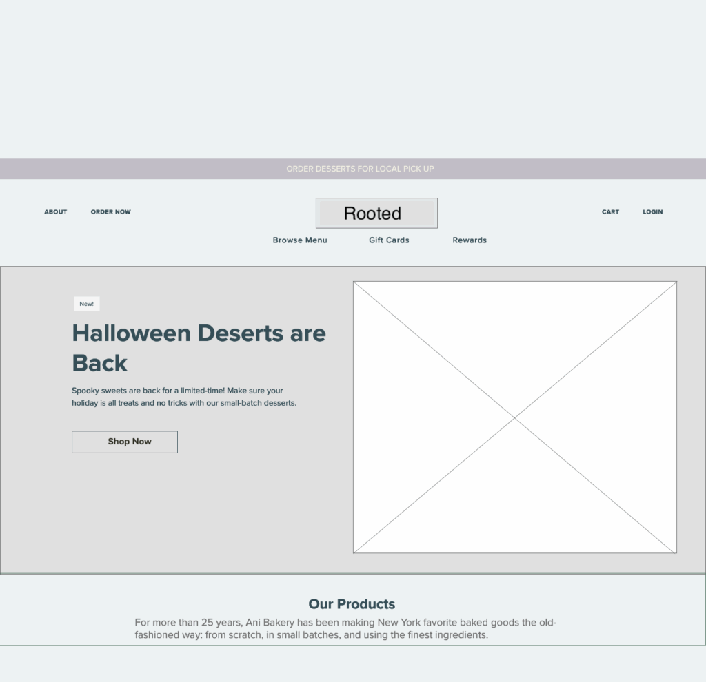
High Fidelity Design
Based on testing, I refined the designs in Adobe XD:
- Search: Added Faceted filters for dietary restrictions, cuisine type, and price range
- Simplified Checkout: Reduced to three steps with a guest checkout option
- Accessibility: Implemented WCAG 2.1 guidelines (e.g., 1.4.3 Contrast Minimum, 2.4.7 Focus Visible)
Accessibility Consideration
Accessibility was prioritized throughout the design process, following WCAG guidelines:
Visual Hierarchy
Implemented properly sized and ordered headings (H1-H6) to improve scannability for users with cognitive disabilities
Landmarks
Clear <header>, <main>, and <footer> roles to define page structure for screen reader navigation
Alternative Text
Provided descriptive alt text for all menu images, with decorative images appropriately marked.
Final Solution
Key Features
- Smart Search: Filters and autocomplete for quick item discovery.
- Streamlined Checkout: Three steps, guest checkout, and order preview.
- Mobile-First: Responsive design optimized for 70% mobile users (analytics).
- Personalized Recommendations: Meal suggestions based on past orders and preferences.
- Quick Order Menu: Curated selection of popular meals for faster ordering
Impact
- Checkout Time: 40% reduction in checkout time (from 5 minutes to 3 minutes)
- Cart Abandonment: 25% projected decrease in cart abandonment rates
- User Satisfaction: 85% rated the experience “very easy” (post-order survey, n=50)
- Engagement “ Longer session duration and decreased exit rates
Reflections and Learnings
- User-Centricity: Iterative testing ensured solutions aligned with user needs.
- Iterative Approach: Constant feedback helps refine and enhance the experience
- Accessibility: Involving users with disabilities early improved inclusivity.
- Challenges: Small research sample, limited diversity; future studies should include varied demographics.
Future Enhancements
Add loyalty program features to boost retention.
Explore third-party delivery integrations (e.g., DoorDash).
Conclusion
The ThymeRoot redesign transformed a frustrating ordering experience into a fast, accessible, and user-friendly platform. By prioritizing user research, iterative testing, and accessibility, we achieved a 20% reduction in cart abandonment and 85% user satisfaction. This project highlights the power of aligning design with user needs and business goals.