Wealth Management Client Portal Design System
Develop a comprehensive design system to ensure consistency, scalability, and effective collaboration for a wealth management client portal.
The Challenge
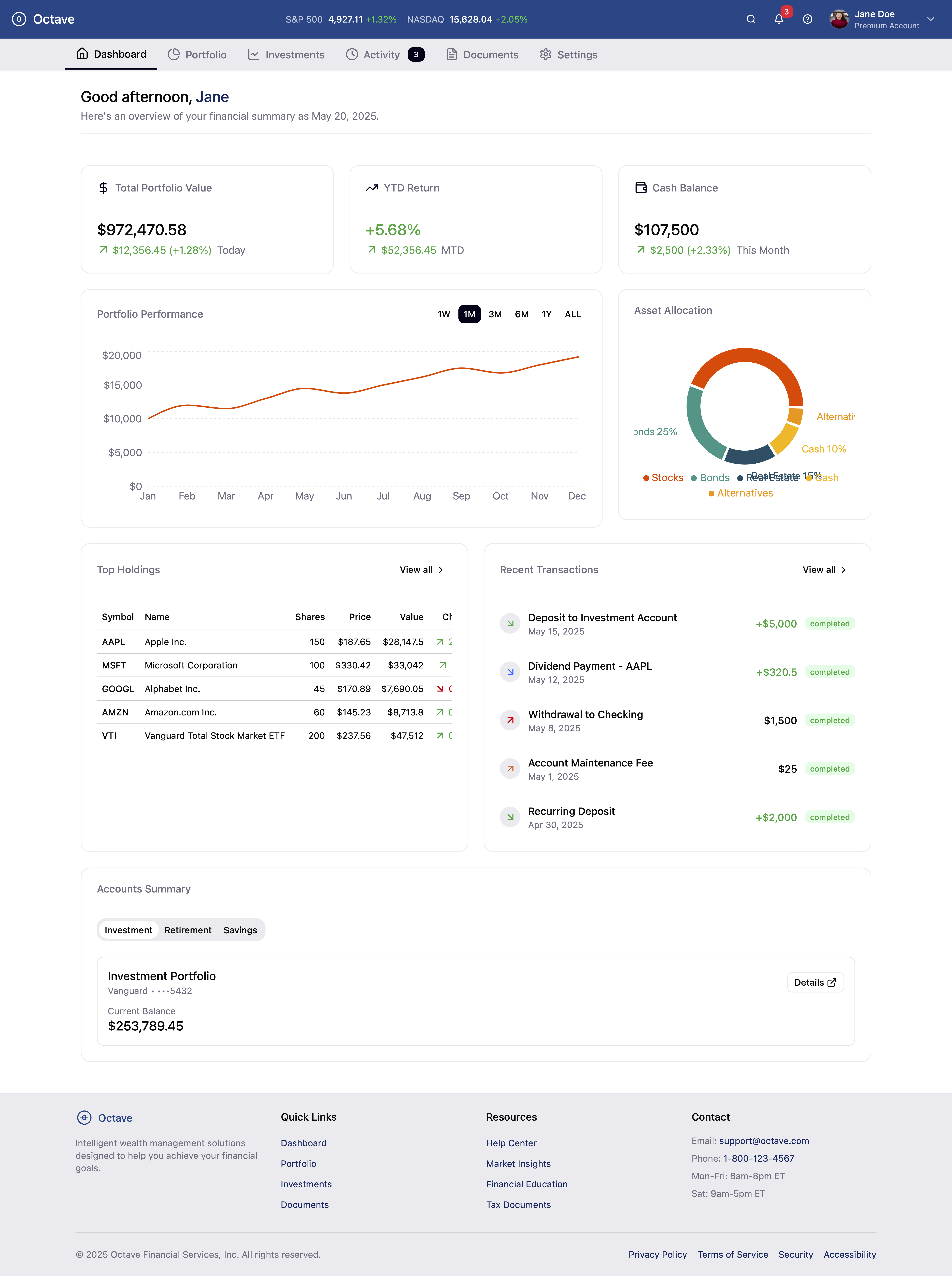
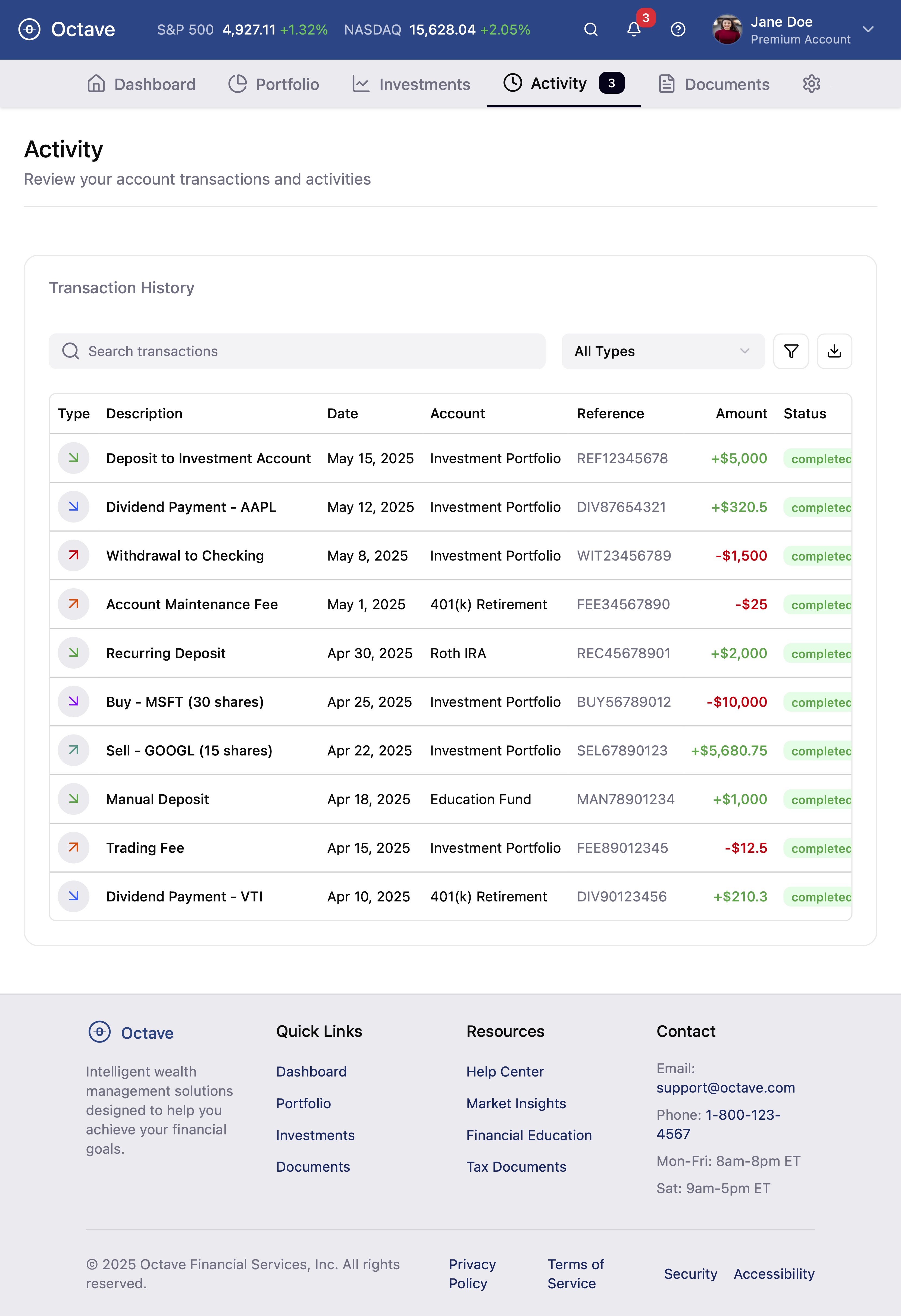
I was tasked with creating a design system for a wealth management client portal that serves financial professionals managing portfolios, analyzing data, and communicating with clients. The existing prototype lacked a structured design system, which risked:
- Inconsistent user experience across the platform
- Difficult maintenance and updates
- Inefficient developer handoff
- Scaling challenges for new features
My goal was to create a professional interface with consistent styling, accessible components, and the flexibility to scale with the product’s growth.
Design Process
Analyzing the Existing Design
- Mapped inconsistencies across Octave’s web and mobile screens
- Grouped elements by categories (buttons, inputs, spacing, color, typography)
Foundations
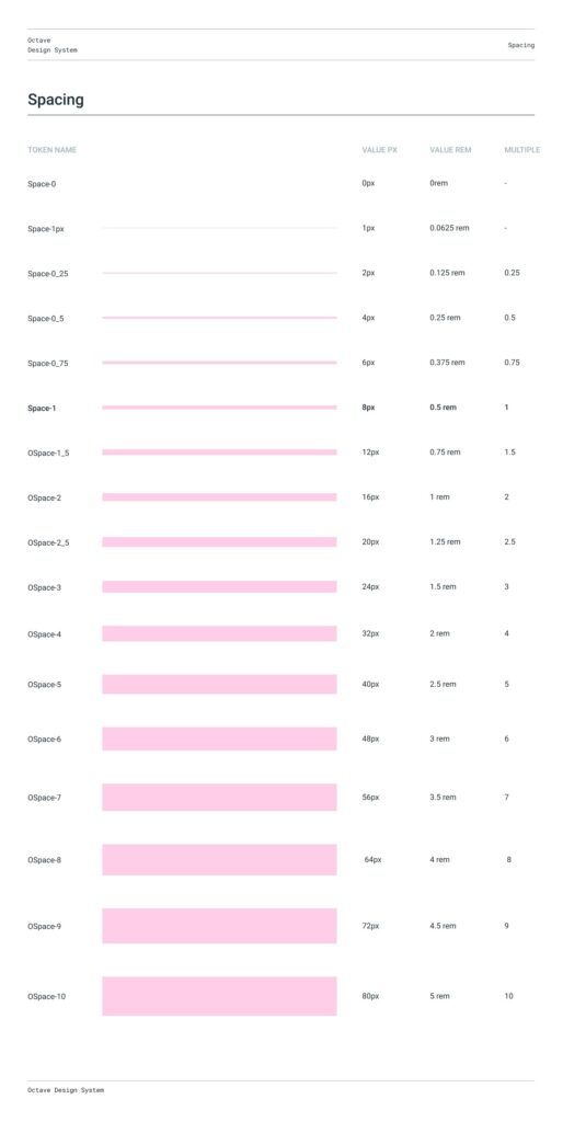
- Grid & Spacing: Introduced an 8pt base system for layout harmony
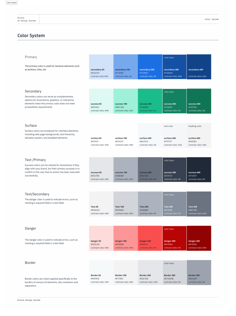
- Color System: Created accessible color tokens with proper contrast
- Typography: Defined a modular scale for heading and body styles
- Elevation: Standardized shadows and depth across surfaces
Component Library
- With foundations in place, I built a comprehensive component library:
- Created reusable Figma components with variants and auto layout
- Designed common UI patterns including:
- Buttons (primary, secondary, tertiary variations)
- Form elements (inputs, selects, checkboxes, radios)
- Navigation components (headers, tabs, pagination)
- Feedback elements (alerts, toasts, modals)
- Data visualization components
- Incorporated all interactive states (default, hover, focus, active, disabled)
- Built responsive variants for mobile, tablet, and desktop views
- Optimized components for accessibility with proper focus indicators and ARIA support
Refining and Documenting
Accessibility Verification: Ensured color combinations met WCAG contrast standards
Documentation: Created comprehensive guidelines for implementation
Key Components
Colors
Typography
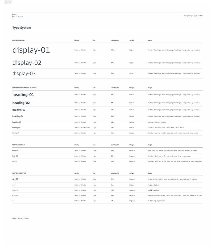
Typography

Spacing
Results & Impact

The design system delivered significant improvements.
Consistency: Reduced duplicate design elements by over 60%, eliminating previous inconsistencies.
Collaboration: Streamlined designer-developer handoff with clear documentation and visual references
Improved cross-platform consistency and user experience with standardized patterns
Enhanced accessibility across all product touchpoints
Established a scalable foundation for future product growth